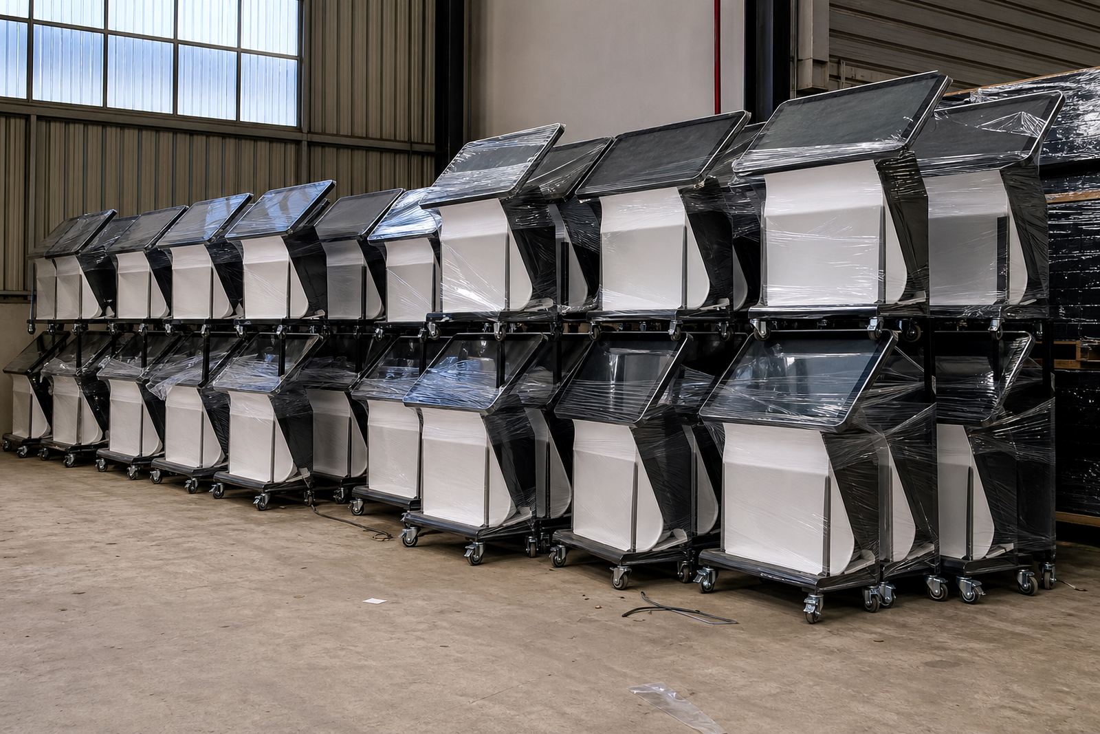

Start With the Store Environment, Not the Colour Chart
Before choosing a colour or wrap, look at where the unit will stand. A kiosk in a busy Johannesburg mall needs a different finish from one in a coastal Cape Town store or a high-traffic Durban branch with humidity and salt in the air. Matt finishes hide fingerprints better, while glossy surfaces can catch light from shop windows, downlights and LED signage. In stores with load-shedding backup power, darker finishes often help the unit look consistent when lighting shifts during trading hours.
We usually begin with a site assessment so the finish suits the floor, wall colour, aisle width and traffic flow. If the unit sits near chrome shelving or a bright promotional display, a calmer colour helps the screen remain the focal point. If it needs to stand out from a long retail run, a stronger accent colour can work well, as long as it still matches the shopfitting and brand rules.
- Check the lighting at opening time and after sunset.
- Look at the colour of nearby fixtures, flooring and walls.
- Ask whether the unit will face direct sun, air-conditioning or damp conditions.
- Decide if the finish should blend in or act as a feature point.
Choose Colours That Carry the Brand Without Clashing
Colour does more than make a unit look neat. It sets the tone for the whole display. Neutral greys, black and white suit most retail interiors and are easy to keep clean. Strong brand colours can work well on trims, base panels or side columns, but too much colour can overwhelm product images and screen content. The best result is usually a balance between brand recognition and a practical, low-maintenance surface.
For multi-site rollouts across Pretoria, Sandton, Centurion and beyond, consistency matters. The same shade should look the same in all branches, even when the stores have different lighting and fixture suppliers. That is why we confirm the finish sample under real light before production, not only on a computer screen. A colour that looks warm indoors may read cooler in a store with large glass fronts, so it is worth checking it first.
- Use the main brand colour on limited areas, not the entire frame unless the store is very open.
- Choose a neutral base so seasonal artwork can change without repainting.
- Test how the colour looks beside packaging, signage and uniforms.
- Keep a record of the approved colour reference for future replacements.
Wraps and Printed Panels: When to Use Them
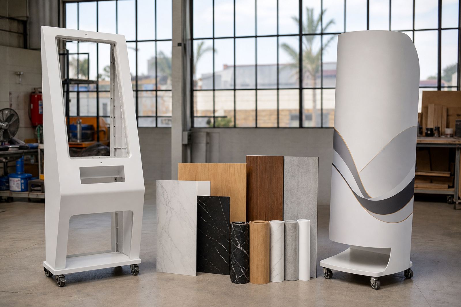
Wraps are useful when a retailer wants the unit to carry a campaign, product story or seasonal message. They can also help if a store wants a softer visual finish than a painted surface. Printed panels work well for product launches, price-led promotions and category zones where the message changes often. In food, cosmetics and electronics retail, a clean printed wrap can give the stand a sharper identity without making the structure look busy.
The key is to keep the artwork practical. High-detail patterns may look impressive up close but can become noisy from a few metres away. Large logos, simple product imagery and clear messaging usually perform better. For a 360-degree product display stand, the artwork needs to be planned on every side so the unit looks finished from the front, back and sides. If one face is left plain by mistake, it shows up very quickly on the shop floor.
- Use printed graphics for campaigns that change often.
- Choose wrap material that can handle cleaning and regular touch points.
- Keep text large enough to read from 2 to 3 metres away.
- Confirm edge alignment before final application.
Surface Finish Affects Cleaning, Wear and Fingerprints
Retail units get touched all day, especially when shoppers are testing screens or turning product platforms. A matt or satin finish usually handles fingerprints better than a high-gloss finish. That makes day-to-day cleaning easier for staff in busy stores where there is not always time for constant wiping. Gloss can still be useful on selected sections, but it works best when used carefully, not over the full unit.
Coastal humidity, regular cleaning sprays and repeated contact all affect how a finish ages. If the unit will be moved during refits or promotions, edges and corners need extra attention because that is where scuffs show first. We also look at how the finish responds to practical servicing. If a panel needs to come off for software or network work, the finish should not chip or peel during removal, and the fix should still look neat afterwards. A good finish saves time later, which matters during trade hours and after-hours work.
- Ask how the surface handles fingerprints, dust and cleaning chemicals.
- Check edge protection on corners, handles and access panels.
- Use tougher materials in high-touch areas.
- Plan for easy replacement if the store runs promotional changes every few months.
How to Match the Finish to the Retail Format
Not every retailer needs the same finish. A fashion store often wants a cleaner, softer visual style, while a tech or cellular environment may benefit from sharper contrast and stronger graphics. In pharmacy, health and beauty, a light finish can feel calm and tidy. In hardware or sporting goods, darker panels often hide marks better and suit the heavier product mix. The point is to support the merchandise, not compete with it.
For stores in shopping centres, the finish also needs to work with mall rules and fire compliance requirements for the fitted area. Some landlords have limits on reflective surfaces or fixed signage positions, so it helps to check these details early. If the display unit sits near a till point or queue lane, the finish should remain clean under constant contact from baskets, bags and hands. That is one of the reasons our project team plans the branding together with installation and support, rather than treating it as an afterthought.
- Fashion and beauty: softer neutrals with limited accent colour.
- Electronics and telecoms: sharper contrast and clear brand blocks.
- Pharmacy and health: light, calming colours with simple messaging.
- Hardware and general retail: practical finishes that hide marks.
Finish Checklists Before Sign-Off and Installation
Once the sample is approved, the last step is making sure the finish matches the order and the site. This is where small mistakes get caught before installation. We check the final colour, wrap alignment, access points, screen openings and any custom branding areas. If content loading or network integration is part of the job, the finish must not block ventilation, cables or service access. A good looking unit that is hard to maintain becomes a problem later.
Before sign-off, the store team should walk around the unit in natural and artificial light. Look at it from the entrance, the queue, and the product aisle. Check for visible joins, bubbles, uneven edges or colour shifts between panels. It is much easier to sort these issues before the unit goes live than after the first weekend of trading. In our experience, a careful finish check saves both time and Rand.
- Confirm the approved colour sample matches the delivered unit.
- Inspect all wrapped edges, seams and corners.
- Check access for servicing, cleaning and parts replacement.
- Test how the finish looks under full lighting and during low light periods.